


In my last term of my first year on BA (Hons) Creative Direction, my course mates and I were given a brief to create our own online magazine as a collective with free reign over what we presented in our individual features. After narrowing down my ideas, I concluded I would split my feature into two parts: Boots to Beers, a written piece on the evolution of lad culture within English football, and Football Shirt Nostalgia, a look back at some of the most iconic English football shirt designs of the 1990s.
This project was especially meaningful to me as I have always loved football and the chance to blend my love for football, to bring awareness to social issues and to explore my passion for sportswear design was very exciting.
At AUB, these chances to explore your passions and interests will come naturally. I chose AUB during my time at Sixth Form and immediately felt drawn to it once I saw the facilities and work from previous alumni on an Open Day I attended. Now that I am studying here, I know I made the right decision. Since starting last year, the creative environments have encouraged me to embrace my ideas fully, I have great course mates, we all inspire each other and my skills become more refined every term. Also, it has given me the confidence to take charge of projects and “creatively direct” for real!
To begin with, we started to toy with some concepts as a group, creating mood boards of inspiration, colour palettes and an overall theme of what we wanted to discuss to our target consumer/audience.
The inspiration for my individual feature came from a general interest for 1990s sportswear and fashion. But once I started to develop the idea, I began to watch documentaries about football players during this era, and my research took me to websites, other magazine articles, podcasts and interviews. After this research, I started to realise just how toxic the setting was for not only the players themselves but for the fans. Lad culture was rife in the 1990s and I wanted to explore its evolution into the modern day – had it really evolved or was it now something else entirely?
I started to develop my article with this in mind and structured it almost as if it were a timeline, from the influences of lad culture at the start to lad culture today at the end. As I developed it further and delved into the many negative impacts of football, I started to ask myself the question, can football do any good? This question is what I chose to round off my feature with, with the purpose of shedding light on the positives that football is bringing to the youth of the modern day.


Once I had my written article nailed down, I could start to accurately visualise the photoshoots and the overall aesthetic of my magazine feature. I sketched and storyboarded the journey through my feature and then I implemented these ideas into ReadyMag. The colours, typography and layout were mainly inspired by vintage football kits and 1990s computer software aesthetics. This in turn helped me decide the tone of my work and to find the balance between a celebration of culture and social commentary.
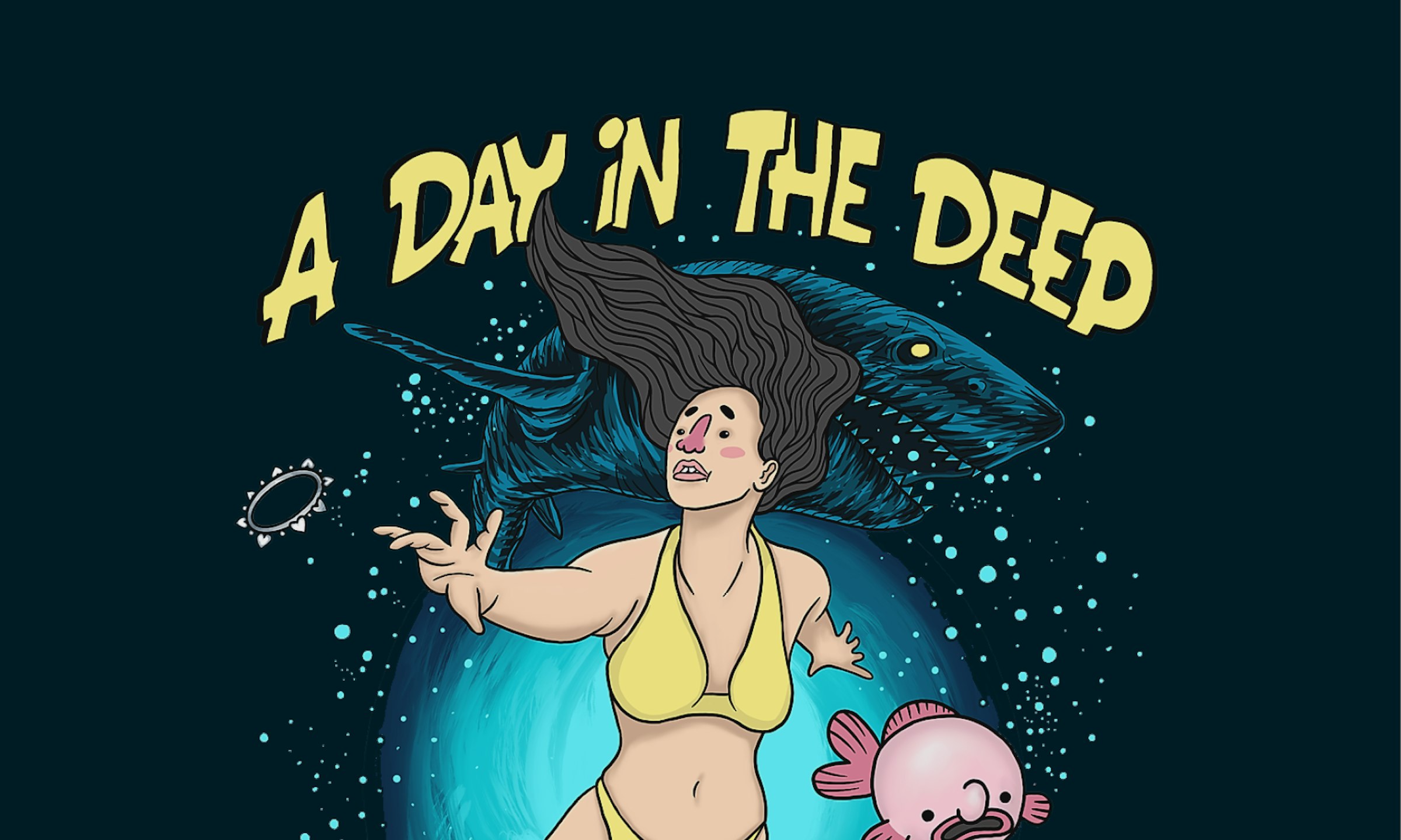
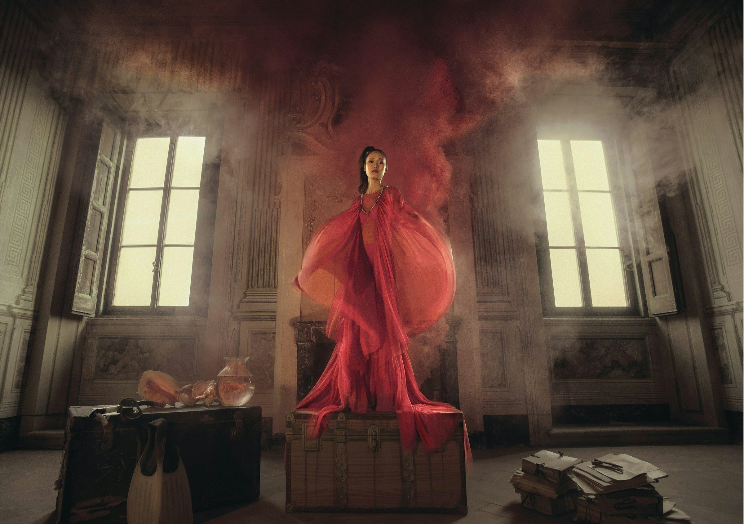
As the magazine was nearly pieced together, the only pieces missing were the photos themselves. My shoots were carried out exactly as I planned in sketches, with four studio shoots (three football shirts and one cover image for my article) and three shoots of my course mate, Dan, as a model wearing the retro shirts outside. I learnt to use Adobe Photoshop in order to edit my images how I wanted them and embraced the generative AI option to add neon light fixtures into my article cover image.
Overall, from this project, I learnt many new skills. Whether that be in writing, using ReadyMag and Photoshop, I also learnt just how powerful design is in sparking conversation on social change and this was undoubtedly the most memorable part of this project. The outcome would not have been possible without the support and facilities here at AUB, as lectures and workshops were key in facilitating my work.
Every project on this course will get you thinking about new topics and ideas and the broad scope of the course will allow you to apply yourself in so many areas key to your development. BA (Hons) Creative Direction will have your ideas and voice heard in the creative landscape.


