


I was interested in drawing from middle school with a specific interest in illustration, stemming from wanting to draw my friends and favourite book characters. Consequently, I spent years drawing mediocre cartoon people (with any stiff pose that meant I didn't have to draw hands) and not thinking much of it.
During school I focused on painting accurately and photography which taught me a lot about portraiture and composition. I then only really started considering illustration as a pathway after reading a few comics and illustrated books and spending time on an animation course with the BFI. After this, I studied Foundation at AUB, finding my way to an illustration specialism as it contained all the possibilities I was looking for: room for an array of styles, the cartoon-type drawing I loved and chances to animate.
Creating the cover
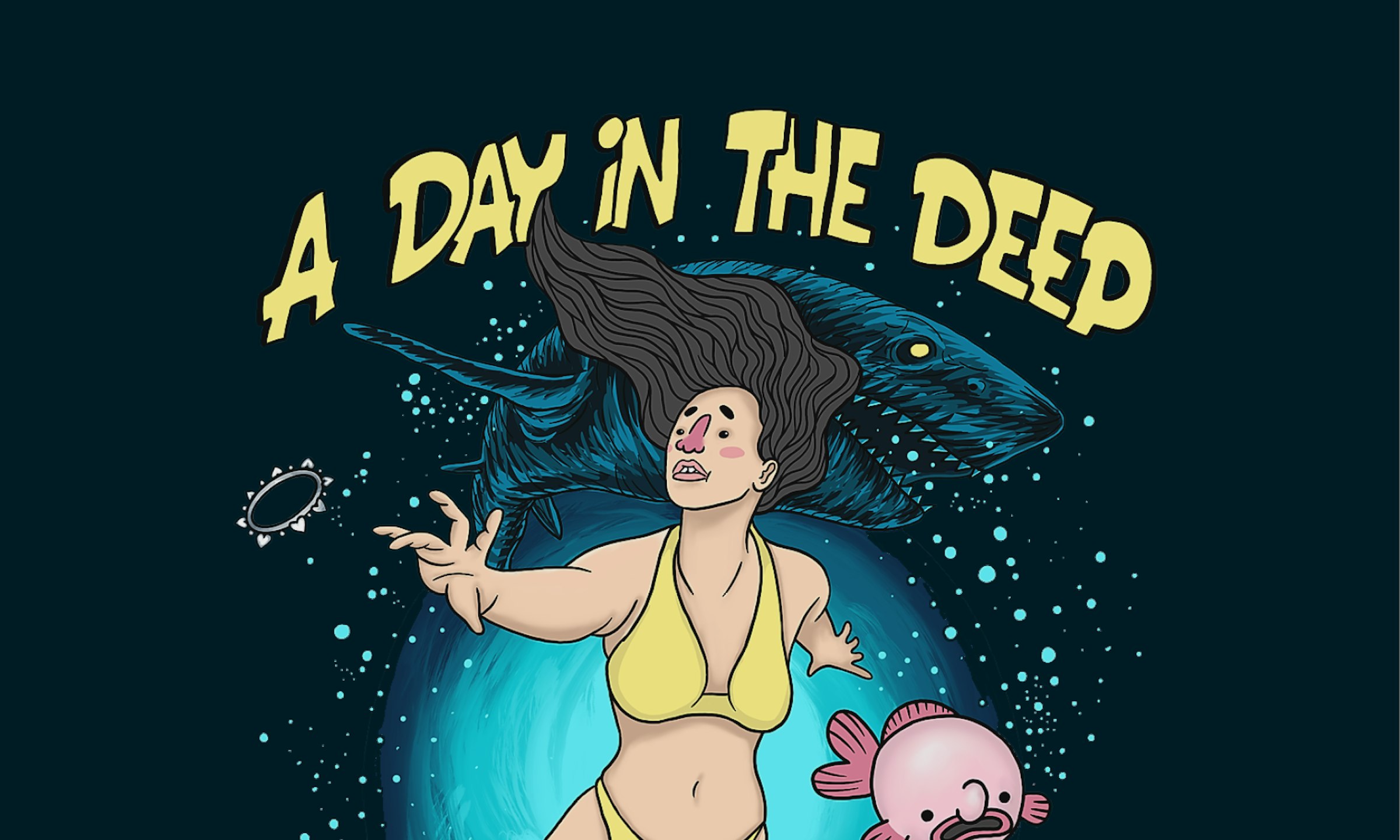
Recently, I took part in War Child’s Secret 7” charity auction – the brief was to design a 7" vinyl cover. Student entrants could enter Secret 7” through the D&AD New Blood Awards, which is where I won my Graphite Pencil Award.
I chose to respond to Gregory Porter's Merchants of Paradise out of the seven tracks available as it was the most evocative song to me without specific visual lyrics, as I wanted to explore visually without directly illustrating from the text. To meet the brief, I aimed for a graphic image suitable for an album cover that would stand out on a shelf, but also one where every visual element linked back to my interpretation of the lyrics.
I listened to the track on loop for a few days whilst sketching the images that came to mind. I actually had two or three almost finalised designs before this, but they didn't have the impact I wanted. Thankfully, the last design suddenly came together quickly after a sketch on a post-it note! Vincent (the BA (Hons) Illustration course leader) gave me some valuable art direction, and I think not overthinking my decisions after this paid off in the final design.
Listening to the track on loop was great for about the first hour. After that I'd say it was probably not the best way to enjoy Porter's music, but it did immerse me in the energy of the music and made picking the colour palette and imagery clearer.
I also spent a few days quite ill whilst working on this, going through two iterations of artwork sat at my desk sniffling and working consistently only to finish a much more detailed design that lacked punch. The challenge then was to take some space from the work (and some vitamins, lol) and return to it with a clear head, able to admit I needed a new idea.
The lesson I learnt with this project was to keep coming back to the brief, as grounding myself in the music and keeping it simple to make a more successful design.


It's super cool to win a Graphite Pencil! I really wasn't expecting even a Wooden Pencil Award, so it was extremely validating to have an external panel of people working in industry acknowledge my work. It also proves to myself that my work can be successful even when very simple, and even that it can be more powerful this way. One of the judges commented that it was "good simple illustration done well" which is really my greatest aim, so it’s lovely to know I'm on the right track.
My one piece of advice
I would say to prepare yourself to loosen your grip on your current way of working, as this course gives you ample encouragement to experiment and find your artistic voice as well as learning how to approach a brief from a brilliant team of lecturers and technicians. The Friday guest lectures have also given me incredible insights from practicing illustrators and enabled me to envision a career.
My favourite projects and opportunities have come from just going for things on the course, saying yes to projects and applying for stuff even if I thought I wouldn't get it.


