


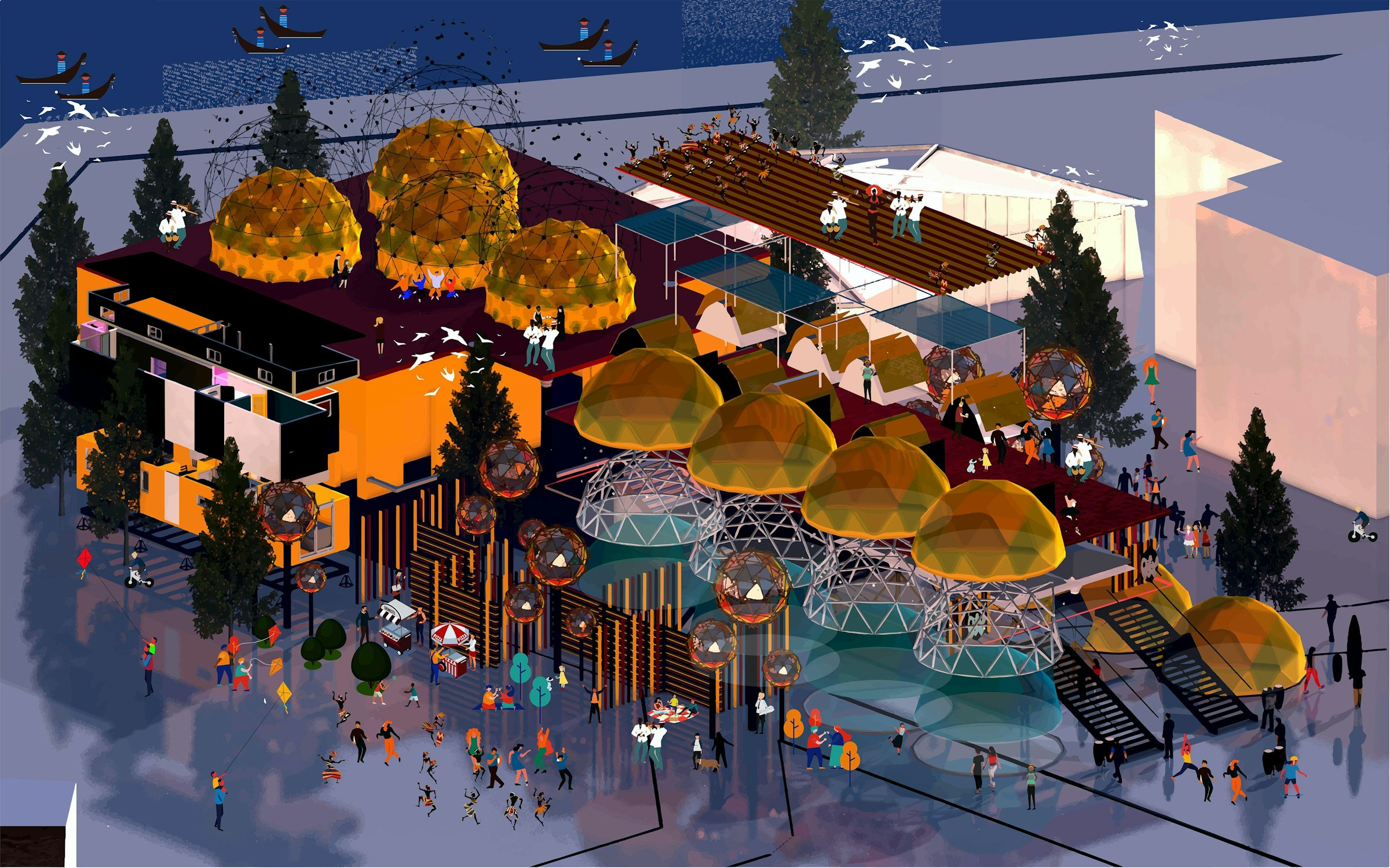


Before beginning our animation project in the second term of second year on BA (Hons) Graphic Design, I was excited to delve into the world of motion design – but little did I know at the time that it would shape the type of graphic designer I wanted to become. In a team comprised of Lauren Gardner, Neha Goswami, Amie Trill and I, we created an animation sequence I couldn’t be more proud of, highlighting an issue we all found important.
Finding the theme of our project was a process that had us considering just about everything! From animals and instruments, to work life and travel. But once we had arrived at the idea of elderly loneliness, we knew we found a topic of genuine importance. It wasn’t long after that we found the perfect charity to partner with, Re-engage, who support the elderly through community events.
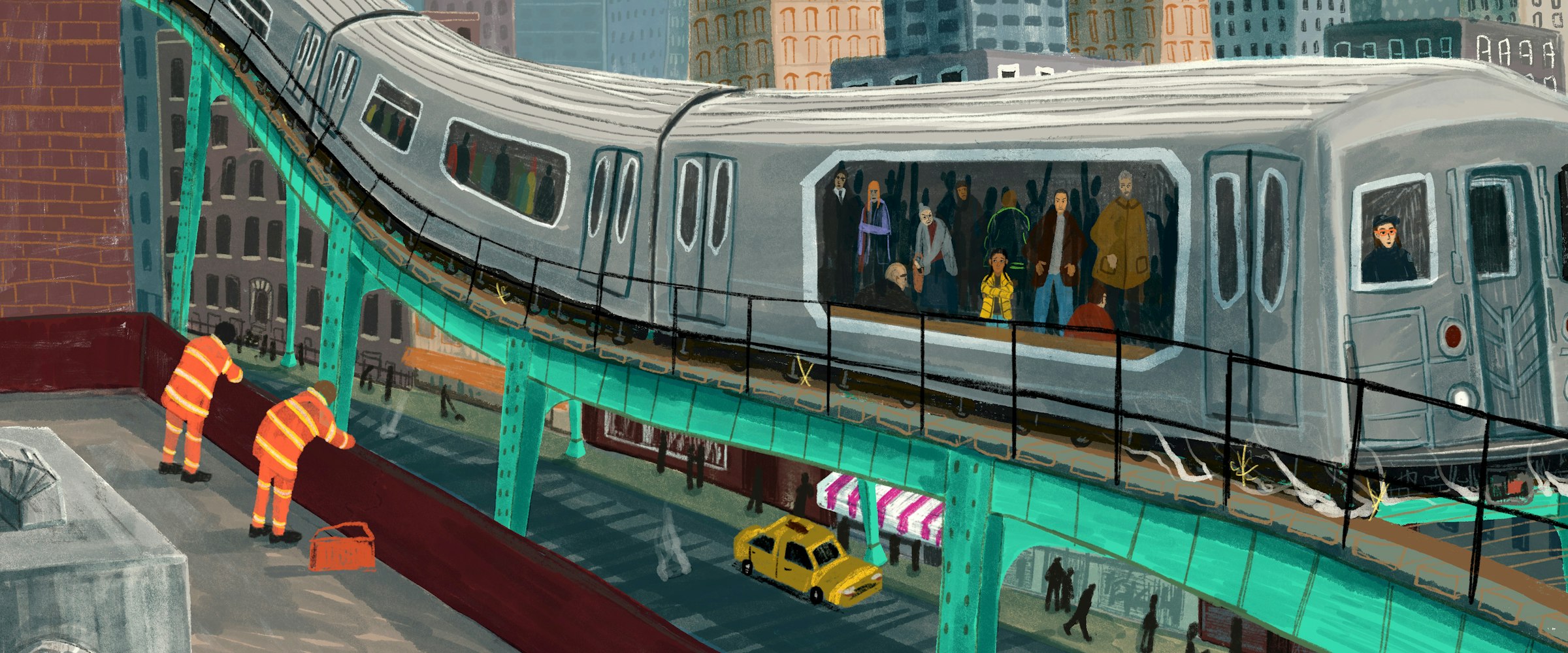
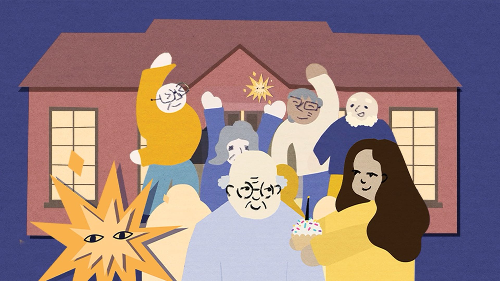
Our idea started out as a basic animatic which storyboarded our concept: a lonely older man, Bert, who is visited by a bright spark who takes him to a Re-engage event. Following feedback presentations, we continued to develop and refine our story, testing different animation styles, pacing, and sound design. The idea of the Spark character came from our early ideation. We wanted the feeling of wonder and excitement that’s felt by the attendees of Re-engage events to come through with our story, and we felt that was best shown with the mystical character of the Spark, representing the volunteers.
Within the team, my role was creating the scenes where Spark and Burt travel to the Re-engage event, with the Spark flying through streetlights, trees and arriving at the town hall. This was my first time creating an animation with a story narrative and characters – it definitely came with its challenges, but I learnt so much about motion from the project that I still use today. The power of pre-comps, posterised time, parallax movement, and sound design are just a few of the things I learnt whilst making the animation.


Together as a team, we often worked together on our individual scenes and learnt from each other’s process. For example, Lauren’s scenes proceeded mine, so we worked together on matching the assets visual design and the videos flow, scene after scene.
At this point as a designer, I had never worked with audio as part of my work. This project gave me the opportunity to discover the power of sound design within work, and something I found to really enjoy. Sound can make or break a video, so when I worked on the soundscape for my scenes of the animation, it opened my mind to a new dimension of design, where audio can play just as big of a role in video as much as the visuals do. Going forward, I will definitely emphasise the importance of sound design in my work, to make it feel that more immersive.
With our animation finally complete, it was a joy to see our hard work all come together, and a relief that my laptop fans could finally take a break! Collectively, we were all so proud of our final outcome, and once I knew Re-engage had the chance to see our video, it felt all the more rewarding.
To any students looking at getting into graphic design, my advice would be to learn motion! This project not only taught me specific techniques and tools that exist in After Effects, but how motion can be built into almost anything. When audiences, whether your lecturers, house mates, or clients, notice work that moves, it creates and immediate point of engagement and gives the piece a clear edge from the outset.
Want to see more of Louis’ work?
Follow him on LinkedIn or check out his online portfolio.
Watch 'Be the Spark'
This content can't be displayed, please accept marketing, statistics cookies to view
Accept to view


