


Arts University Bournemouth (AUB) has unveiled its 2027/28 prospectus, moving away from the traditional bound book in favour of a customisable, card-based system designed to reflect the bespoke nature of creative education.
Developed entirely in-house by the AUB Brand team, composed largely of AUB alumni, the new prospectus consists of a series of individual course cards that prospective students can ‘pick and mix’, allowing them to curate their own journey.
The carabiner keyring
Central to the design is the carabiner keyring. Sourced and produced by Sussex-based PurePrint Group, who also printed the cards on their Litho press, the custom-made carabiner serves as a physical anchor for the course cards.
By moving to this modular format, AUB has created a ‘lifelong object’ that rejects the waste of traditional brochures with students only taking the information relevant to them and allowing AUB to update individual cards without reprinting entire volumes.
Emma McEvoy, an AUB alumna and graphic designer on the AUB Brand team, came up with the carabiner concept.
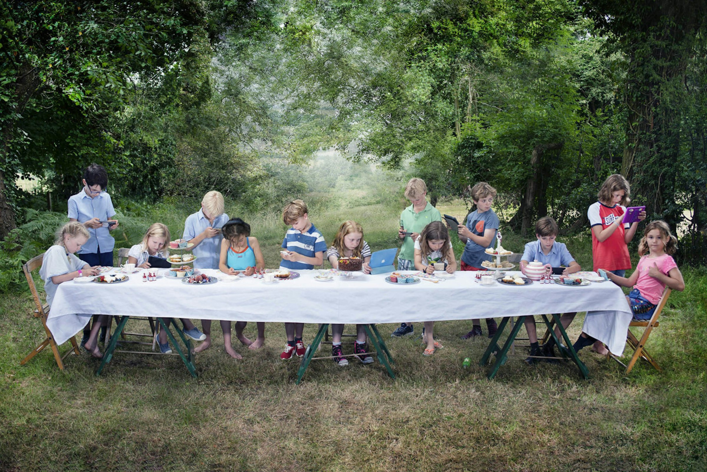
“The idea really kicked off from our research into Gen-Z audiences," she says. "We found that there was a strong desire for authenticity and customisation, giving our prospective students something that feels genuinely tailored to their creative path.
“The carabiner keyring turns the prospectus into a toolkit or a guide for the arts – it's a tactile, collectible object that students can build themselves, reflecting the fluid and experimental nature of how we work at AUB.”


The card-based trend
The system organises courses into eight ‘creative identities’ or archetypes: The Artist, The Maker, The Performer, The Icon, The World Builder, The Visionary, The Storyteller, and The Strategist.
This card-based approach taps into a significant industry trend seen in global campaigns from brands like Netflix, who recently utilised ‘tarot-style’ cards to help users navigate content through archetypes rather than generic genres.
“We wanted to move away from static descriptions and toward creative identities,” Emma explains. “Whether you’re a World Builder or a Visionary, these cards help students figure out how they work creatively so they can see which courses sit in that same realm. It’s about identity and discovery, which we know is a huge driver for this generation of creatives.”
Karen Bird, Senior Brand Designer at AUB, adds, “By mapping out these cards into creative identities, we’ve been able to have much more valuable conversations with young people. The immediate reaction at UCAS fairs has been a resounding 'wow’ from both students and careers advisors.
“The real magic happens when students start interacting with the cards in groups. It triggers these brilliant creative conversations where they're identifying with different archetypes – saying, 'Oh, you're this,' or, 'I'm that.'
“From a careers perspective, it’s proving to be a massively valuable tool. By mapping the cards to potential career paths, we’re helping young people who know they're creative, but aren't sure where that leads, to see the vast career options available. It shows them that a passion for art might actually lead into a career in a completely different area they hadn't even considered yet.”
Entrepreneurial collaboration
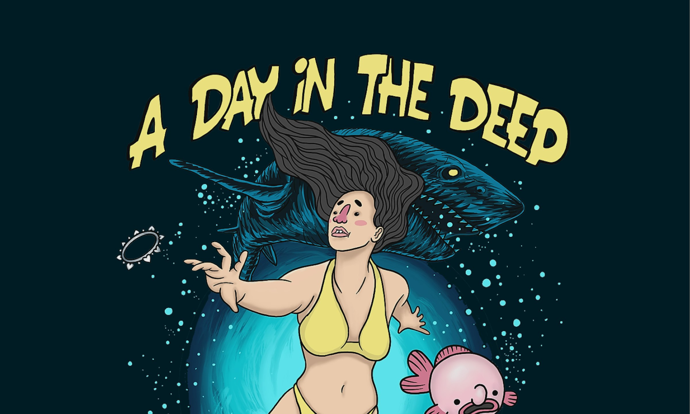
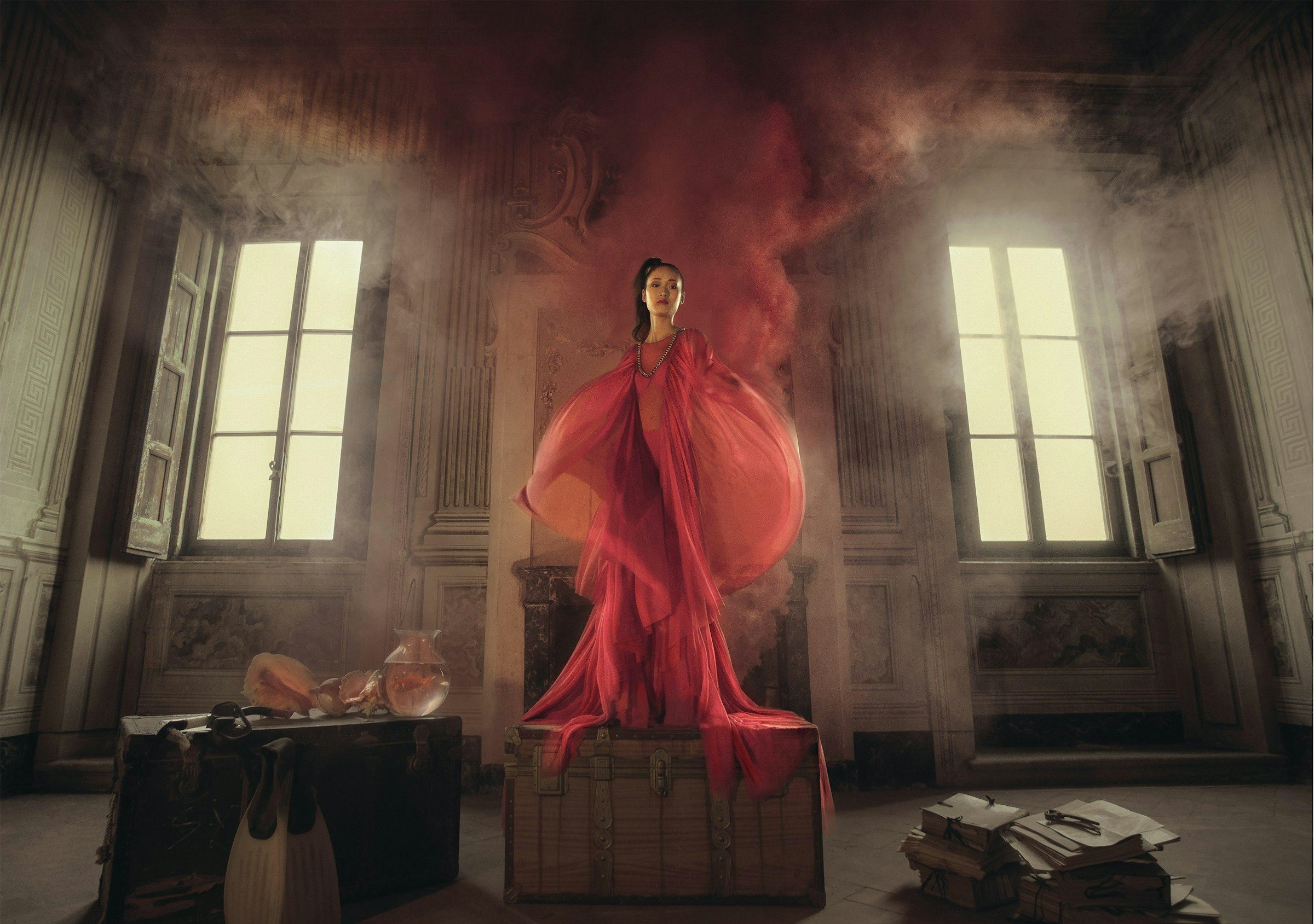
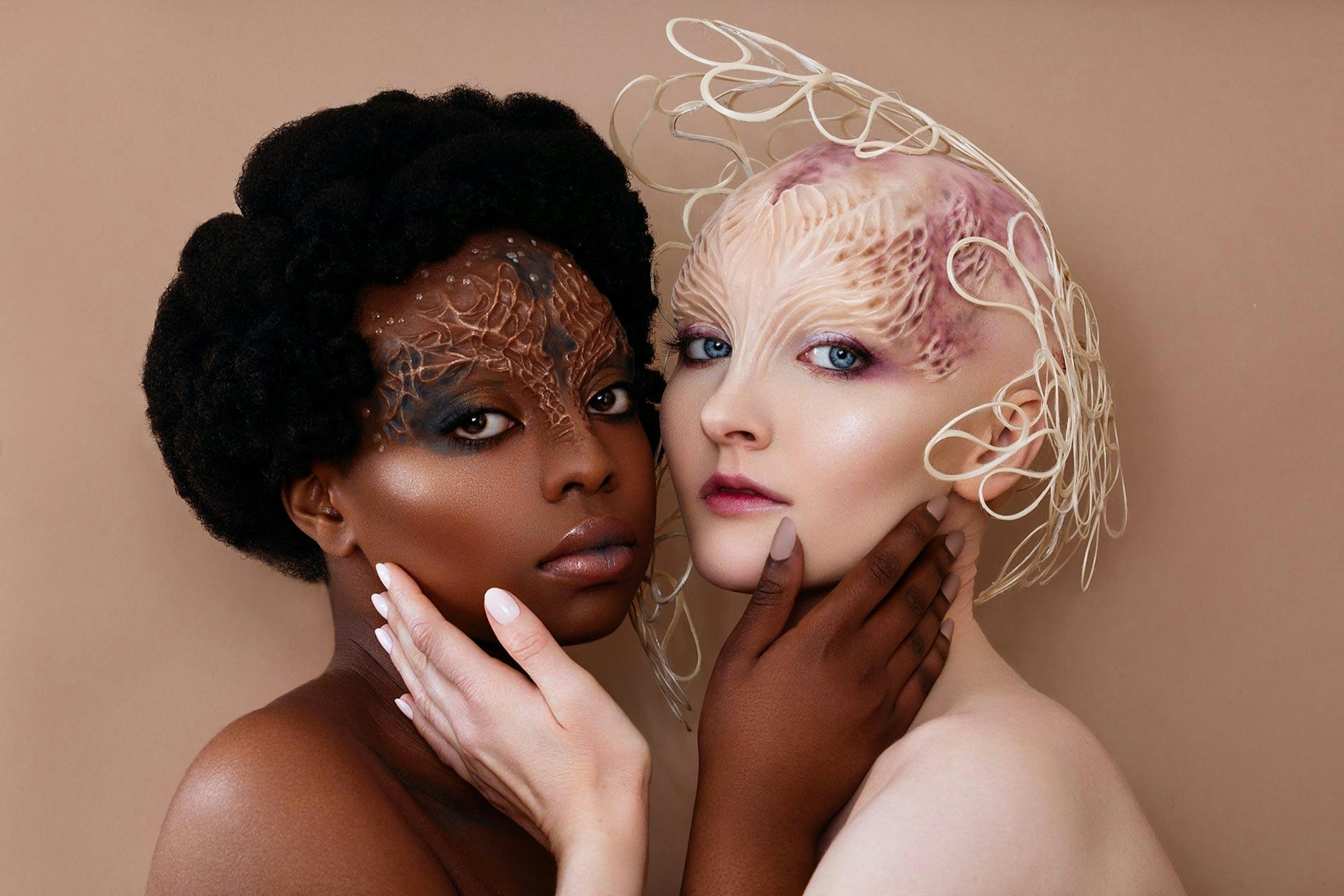
A central pillar of the project was the involvement of AUB student Ruth Virgo, a third-year BA (Hons) Commercial Photography student who was paid to produce the photography for the project. In a nod to high-end craft, the imagery was shot on medium format film, providing a filmic quality and level of detail rarely seen in institutional marketing.
The project eschews glossy, digital perfection for the soft colours and fine grain of Kodak Portra 160 film. This approach was inspired by a documentary project Ruth produced during her second year and shared on her Instagram, which caught the eye of Harry Davenport, Senior Digital Content Officer on AUB’s marketing team.
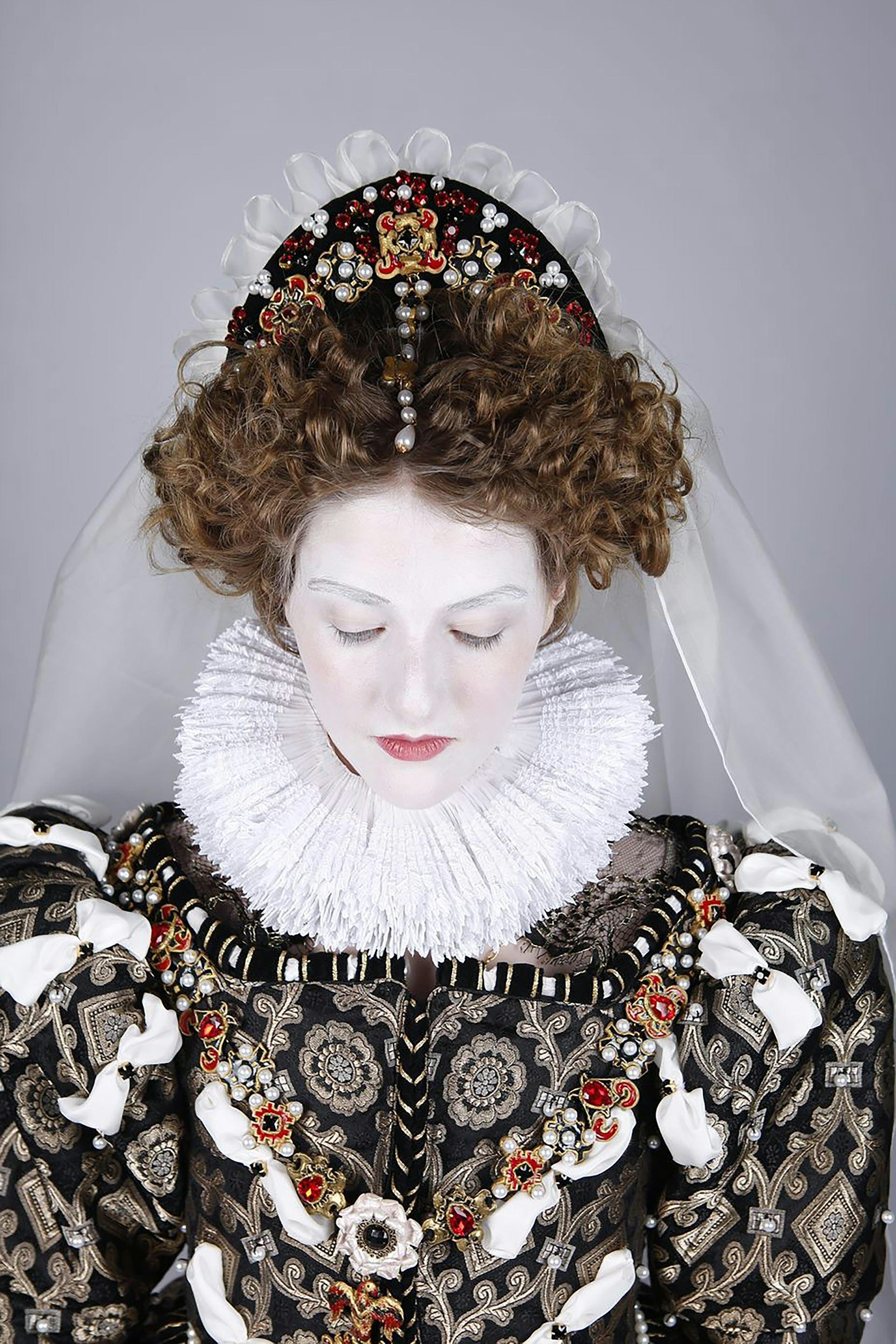
Harry, who holds a photography degree from AUB himself, saw Ruth’s photo of Ellie Pratt, then a BA (Hons) Fine Art student, taken in a studio environment and felt the shot fit their marketing brief perfectly: to capture eight ‘creative identities’.
"It was a shot of a student in their real making space," says Harry, "even though there was some set dressing and art direction from Ruth, we all really felt this authenticity coming through.
“As well as the authentic composition that Ruth had curated, I could see that she was also shooting on film which added an analogue layer of authenticity that we really appreciated.
“Ruth was already doing what we were looking to do, so it made complete sense for us to bring her on board for this commission, to take the photographs for each of our archetypes [...] for the new AUB prospectus.”
Ruth, who was professionally commissioned and paid for her work by AUB, adds, “I couldn't believe they chose me out of everyone to shoot this series. Of all the students on all three years of both the BA (Hons) Photography and BA (Hons) Commercial Photography degrees, not to mention MA Photography! Being asked to do this commission made me feel seen and was really validating of the time I’ve invested so far into my photography career. It feels like a defining way to conclude my three years of study at AUB.”


Launch and exhibition
While the new prospectus began making waves at UCAS fairs across the country earlier in the year, it was officially launched at AUB on 13 May.
To celebrate the launch, AUB hosted an exhibition titled The Archetypes, showcasing the design process, the medium-format photography, and the evolution from initial concept to the final carabiner key ring.
On organising the exhibition, Harry says, “My photography degree instilled a real fastidiousness about framing, so it was very important to me that for this exhibition they were all handmade by a local framer, professionally mounted and glazed with UV70 anti-reflective art glass.
“The prints were produced on site using our Chromira printer – which creates C-type prints (i.e. from light-sensitive paper like you would in a colour darkroom) using LED exposure. We intentionally chose this as the printing process as it’s similar to analogue techniques and it ensures we retain the filmic quality of the medium format.”
Following graduation, Ruth plans to move to London to pursue part-time freelance opportunities, carrying the distinct visual style developed during this landmark AUB project.
Find out more about The Archetypes exhibition on our website.