- Home
- Student Stories
- Designing for tomorrow: community, cultu...
For MA Graphic Design (Online) graduate Dan Bramfitt, the last two years have been a transformative journey of self-discovery, career shifts and creative realignment. Transitioning from a background in contemporary art within tattooing into graphic design, Dan intentionally narrowed his focus toward work that aligns with his core identity and values.
Having just handed in his final project, Dan spoke about his completed work, an ambitious event design concept exploring how we can learn and build from historical queer actions to find strategies and solutions for today and into tomorrow, alongside how his queer identity and neurodivergence drive his practice, and why design should be an expressive tool for building real-world connection.
Can you tell us about what you created for your final project?
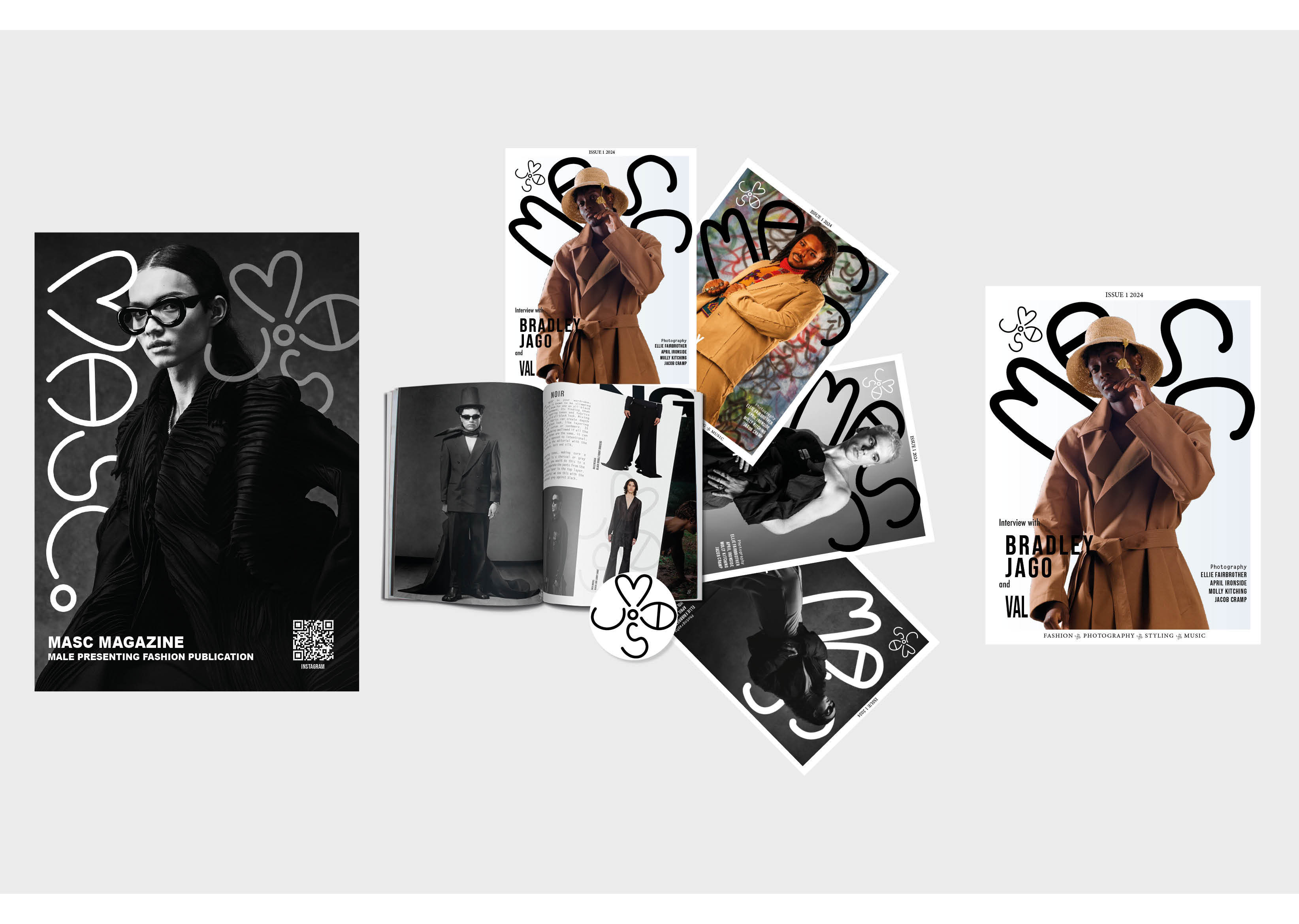
It morphed quite a lot over the course of the MA. I initially started looking into radical design and how expressive visual language linked with ethics-driven practices could shift the design world. But as time went on, my focus shifted, heavily inspired by current actions and aggressions towards the queer community, such as the attack on Berlin Pride or the UK's slip down the rainbow map scale, alongside broader cultural happenings. Turns out that being vexed is actually quite productive! The project evolved from a magazine concept into a full event design project.
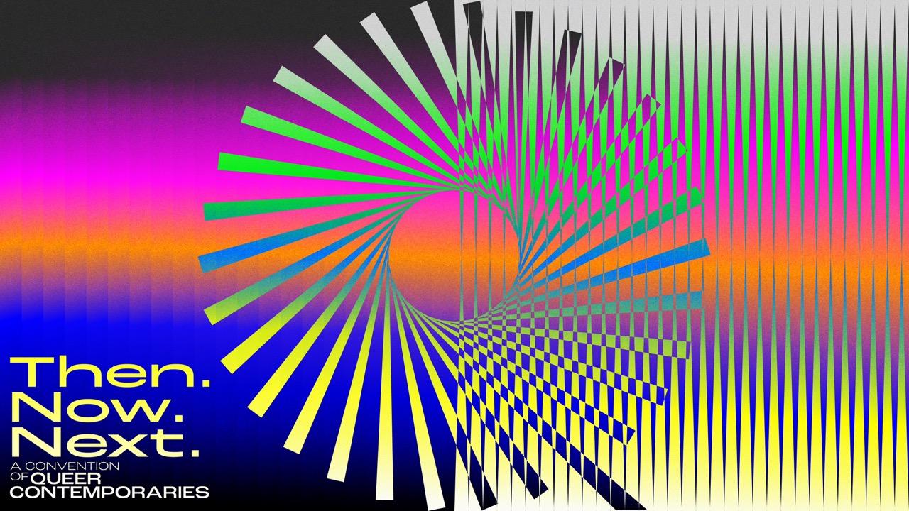
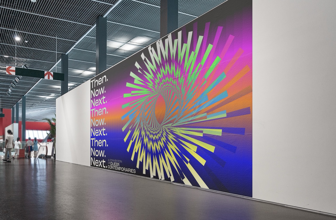
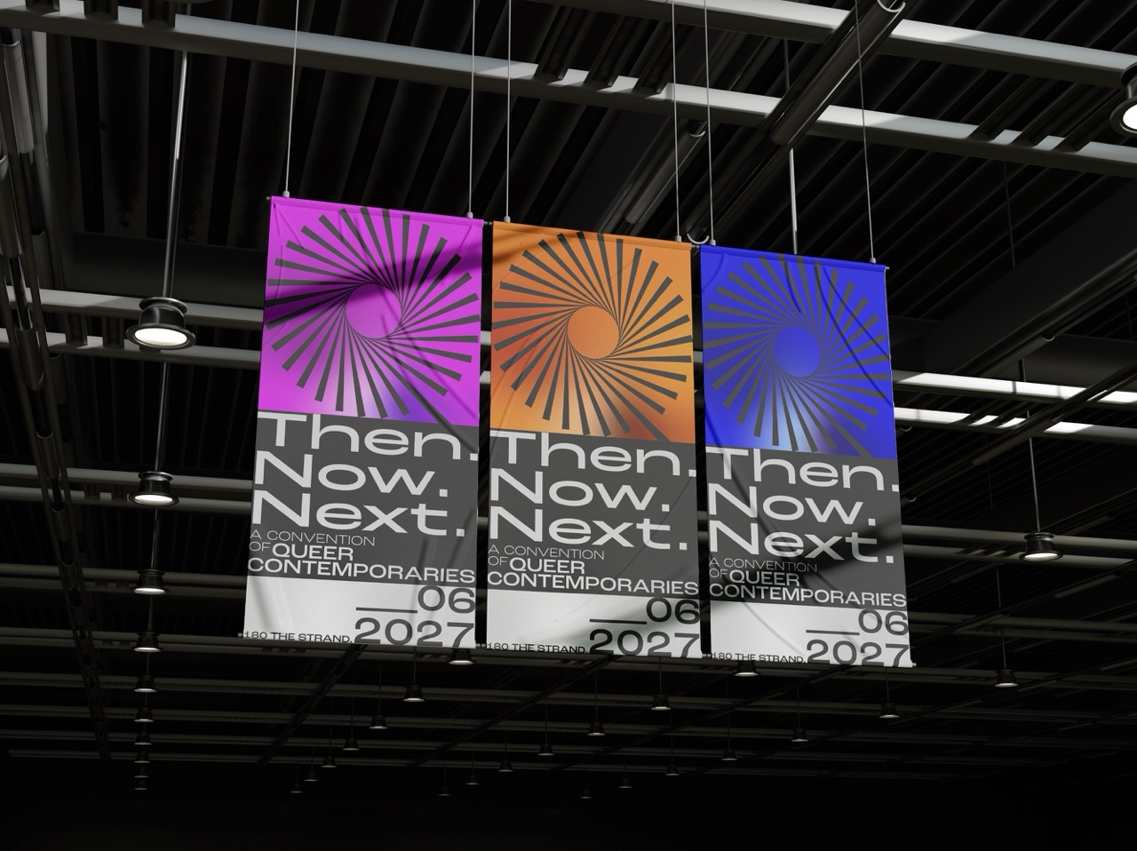
The angle I explored is called Then, Now, Next, a convention of queer contemporaries. It’s built around three central, interwoven pillars: looking at what we can learn from communities of the past and the resistance that won our rights today; how our resilience today shapes a better world; and how we can speculatively imagine the next. It’s an educational and celebratory exploration of how we build a better tomorrow for future generations and our older selves.
How does graphic design bring that concept to life?
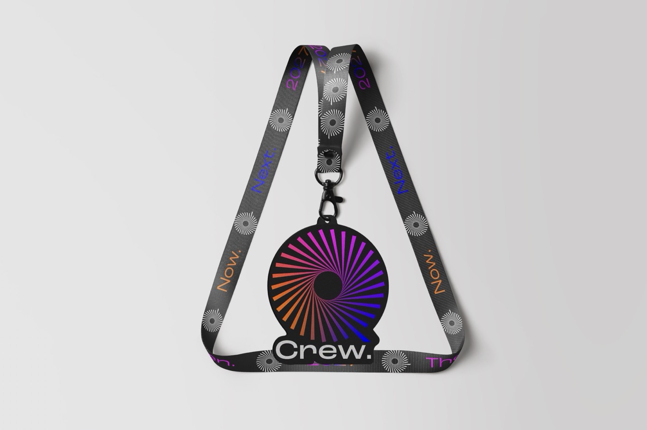
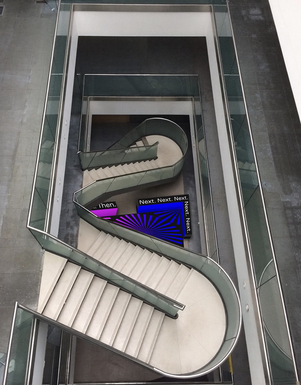
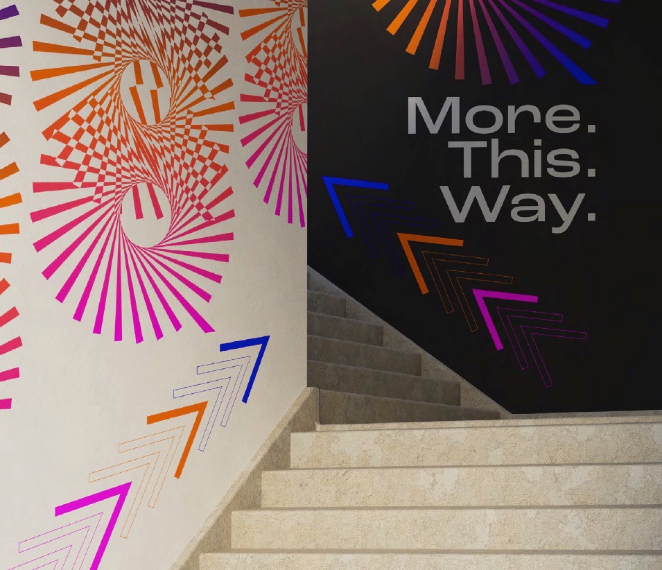
The convention itself was the core concept, but the graphic design aspect was all about event branding and spatial communication.
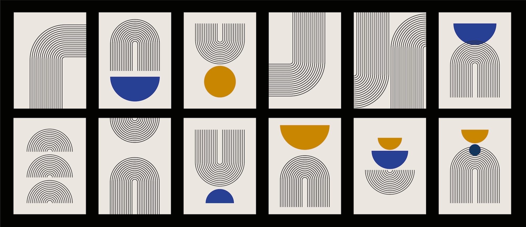
The event required a futuristic, abstracted visual identity, so I looked at the works of op-artists like Bridget Riley. Optical illusions are created to challenge perception and encourage an alteration of perspective, so they were the perfect match for a disruptive positioning.
The logo is built from triangles, a shape with heavy queer legacy, from Nazi persecution to its repurposing during the HIV/AIDS pandemic with the Silence = Death project. The central logo features an abstracted Q form made of 30 triangular segments symbolising boundless creativity, plus one larger segment representing individuality.
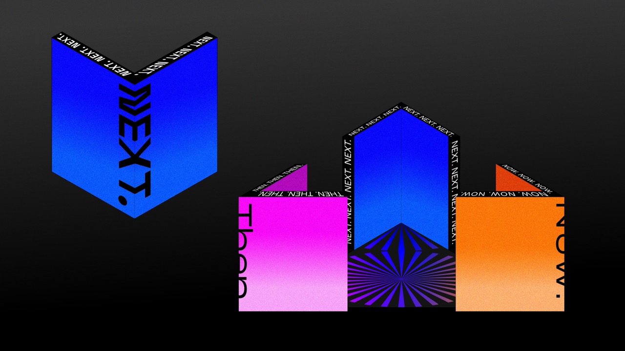
The colour palette uses pink (referencing the historical triangle), alongside orange for healing and the now, and blue for serenity and hope for the next, colours referencing the pride flag. This was pulled together with a modernist typeface with a vast number of font variants, together creating a harmoniously disruptive visual synergy.
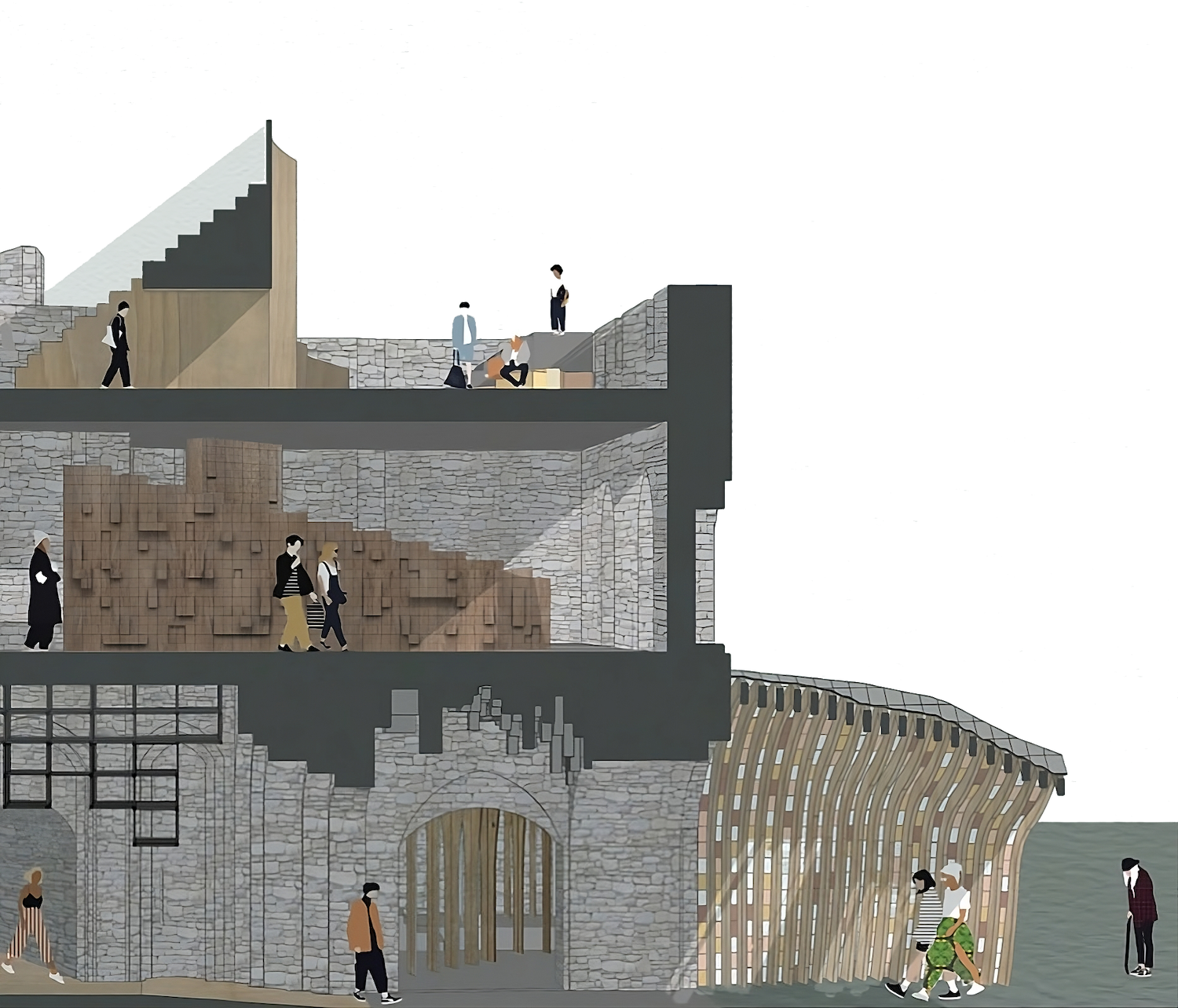
At the heart of the physical event is the Connection Pod, a triangular, V-shaped installation representing the past, present and future. Its interior acts as a safe, protected environment where attendees can pin notes, share stories and leave active, first-person storytelling archives that will exist for generations to come.
Is this a real-world event, or more of a conceptual blueprint for what could be?
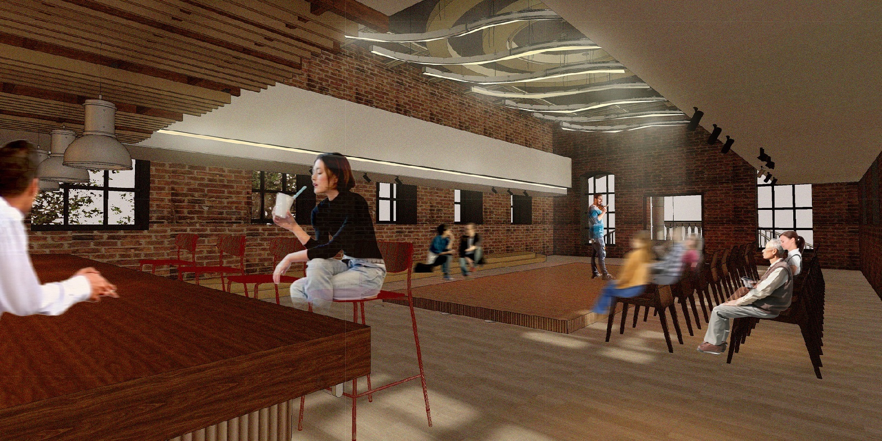
The whole purpose of the project was creating space and place to meet and connect executed with really chic design. It’s a design solution to a real problem: amplifying visibility. Visibility acts as an educational tool, showing that these histories exist, that queer venues are vibrant, cultural spaces, and that people aren't alone. It’s about creating physical spaces where people feel safe and connected.
Growing up in the Northeast of England, it’s not that there wasn't a vibrant queer scene around me – Newcastle actually has a great scene. Rather, as I entered my early twenties, I was specifically looking for a contemporary queer scene that I identified with more. I remember looking online and eventually stumbling across contemporary publications like MEAT magazine, which featured real humans, and BUTT magazine with its platforming of queer subcultures, realising, “Oh, people are out there, and they're doing interesting work”.
With everything happening globally right now, there’s a real hunger for people to understand how queer communities in the past banded together, broke through barriers, and created space for themselves during tough times.

Is this the first time you’ve actively centred the queer community in your design practice?
Directly as a design brief, yes. But as a queer person, everything I do is inherently motivated by that perspective anyway. My inspirations naturally come from that world.
When I worked as a contemporary artist within tattooing, a massive portion of my client base identified as queer. While it's definitely strongly linked to a defined sexuality, to me "queer" is also a broader perspective, a viewpoint and a stance. You see the world through a distinct context. In that sense, my work has always been informed by my identity, even if it hasn't always been overtly visual in every project.
In traditional design education, practitioners are often told to detach their personal identity from a client brief. What’s your take on that?
That approach has never really resonated with me. I can’t just switch my identity off, and why would you want to? You should bring your lived experience and perspective into your work.
Clients should want to work with you because your values and identity align with theirs. Throughout this Masters, I’ve tried to build projects that I can genuinely see existing in the real world. That’s what gives design its relevance and purpose.
You’ve also spoken openly about receiving an ADHD diagnosis during the first month of the course. How has neurodivergence intersected with your work and your identity?
Receiving that diagnosis at 33 was huge. The last two years on the MA haven't just been about learning design; it’s been two years of retraining my brain, figuring out what I excel at and where I struggle.
There’s definitely an intersection between my neurodivergence, my identity, and my work. My brain naturally thinks in expansive, left-of-field ways. It’s helped me realise that while I love graphic design, I’m drawn far more to art direction and creative direction than the micro-level details of art working. Creative direction allows me to lean into big-picture, holistic thinking.
Now that you've completed the course, what kind of work are you looking to take on next?
I want to collaborate with purpose-led organisations, underrepresented voices, and people who are actively trying to make positive change in the world. Moving forward, I’m looking to develop concepts like Then, Now, Next into a professional context, run smaller-scale prototypes, and pitch for funding and partnerships.
We live in an increasingly synthetic, digital world, and people are craving genuine connection. Design has a powerful role to play in facilitating that human connection, whether that’s through brand identity, community events, or educational spaces.
Being paid to be creative is a privilege, but at the same time, you have to be realistic about needing to pay rent and live – London is hard! Balancing that economic reality while ensuring the work I put out remains fulfilling and meaningful is the ultimate goal.


