


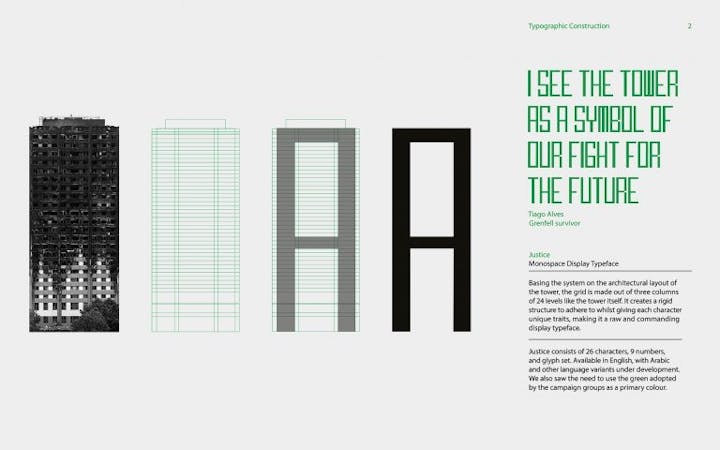
Justice is a monospaced typeface for the Grenfell campaigners and community, designed to help create a unified voice for the upcoming two-year anniversary of the tragedy.
Dan said: “I live down the road from Grenfell Tower, and can see it from my window. Originally, Justice started out as a response to the D&AD Monotype brief, to unify a community through typography.
“The brief acted as a catalyst to addressing some of the issues facing the local community – mainly the fact that, two years on, there’s still been no justice. The exposed skeleton of the tower that looms over the neighbourhood provides a constant reminder of the 72 who lost their lives.”
Speaking about his winning work, he added: “The recognition and support of Justice has been great, especially picking up a gold award at Creative Conscience – having it validated by peers and industry professionals is incredibly encouraging, especially when the project is based around such a raw and sensitive topic.”


