


Each year, Dyson and BA (Hons) Graphic Design host the Dyson Creative Challenge, an intensive, two-week design competition. This year, the client we were designing for was ACT Medical and their ‘B.O.B’ (‘balloon occlusive barrier’) device, which is a medical instrument designed to be inserted into gunshot and stab wounds to stem critical bleeding.
When the Dyson challenge was announced, I knew I wanted to take part. It was a complete step outside my comfort zone – designing for a medical device – but I was excited to test myself and learn some new skills. The whole challenge was launched and completed in under two weeks, meaning careful time planning and a quick turnaround were really important, so I didn’t waste any time getting started.
Day one of the challenge began with Dyson launching the brief, giving us a sense of what is expected and what previous design challenges have included. I believe this was the first year a device to be used by medical professionals was the subject, so I felt a little bewildered about what I was going to be able to produce.
I remember feeling very daunted – everyone else was in teams of three, and I was solo – and without any 3D modelling experience, designing a medical item and its packaging seemed a bit ambitious. But after some words of encouragement from the Dyson team and my lecturers, I decided to give the project everything I could, regardless of any gaps in my skills.
The first stage of the project was diving head-first into research: as the brief was such a technical one, and the target market so specific, I needed to be sure that my tone, touchpoints and deliverables matched where the product would exist. I looked at existing examples of similar medical devices, like EpiPens and defibrillators, noting the tone that surrounds them and the visual language of emergency response items. I also researched gun violence and knife crime statistics, focusing on knife crime due to its prevalence in the UK.


Given the short length of the project, planning and strategy needed to begin quickly. I wanted to plan out my communication strategies, which would then allow me to design my marketing and visual communication methods and touchpoints. Again, given the specificity of the target markets (I chose the Metropolitan Police as my main audience, and teachers and first aiders in schools as my secondary audience), regular marketing methods like billboards and Instagram adverts weren’t appropriate, instead being replaced by trade shows, staff room posters and LinkedIn sponsored ads.
Once my strategy and research had been completed, I was able to move into designing – the most fun part! I started off by doing some visual research, this time into existing medical companies and medical devices, to see any overlapping styles and universal similarities. I wanted the device to feel unique, but it still needed to feel medical, not like an item the public would use. This was hard, as someone who loves to make bold and typography-focused brands with lots of colour. We were asked to create three distinct routes for the initial interim pitch to Dyson, allowing them to select our strongest route, or combine elements of different ideas.
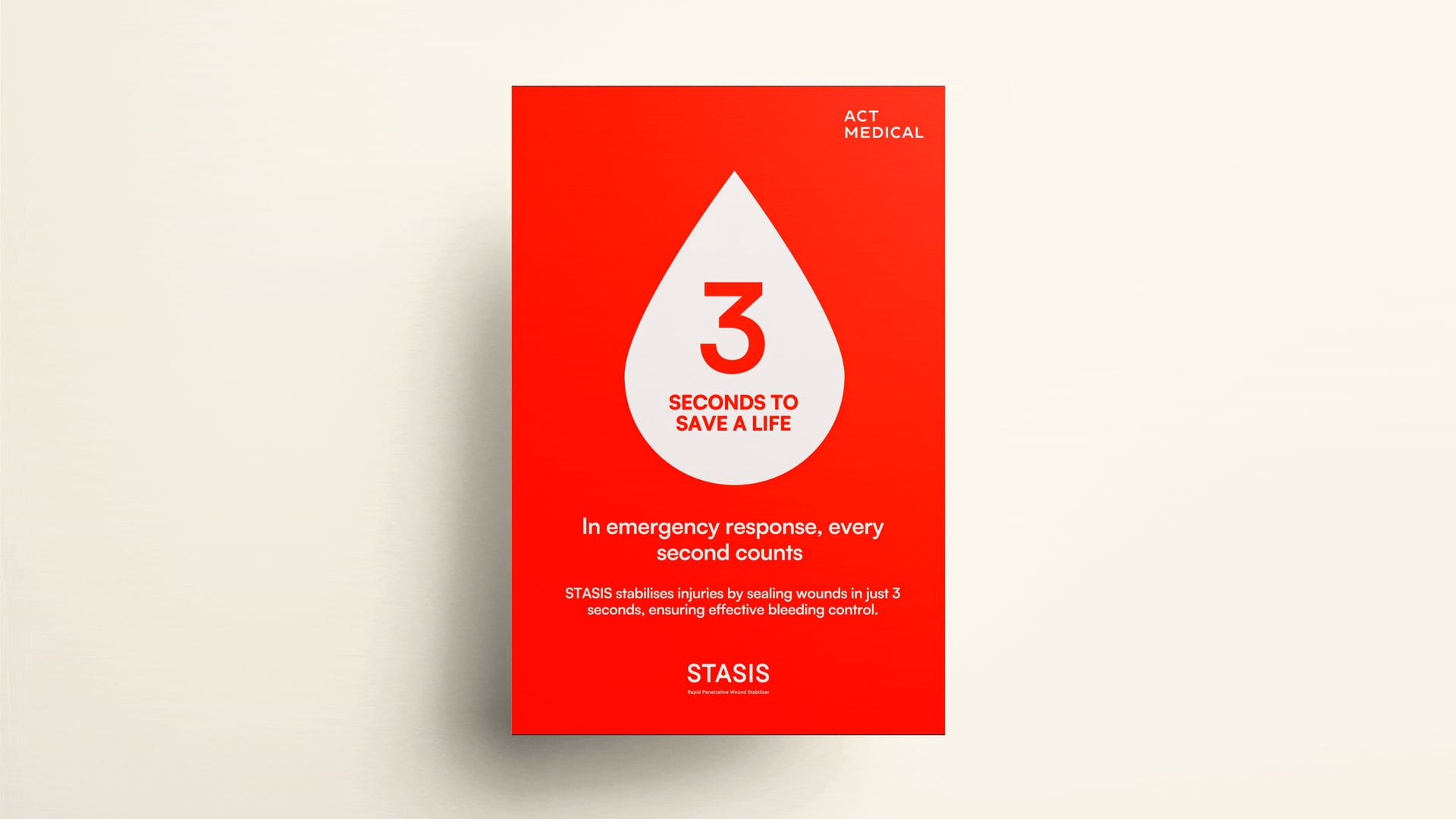
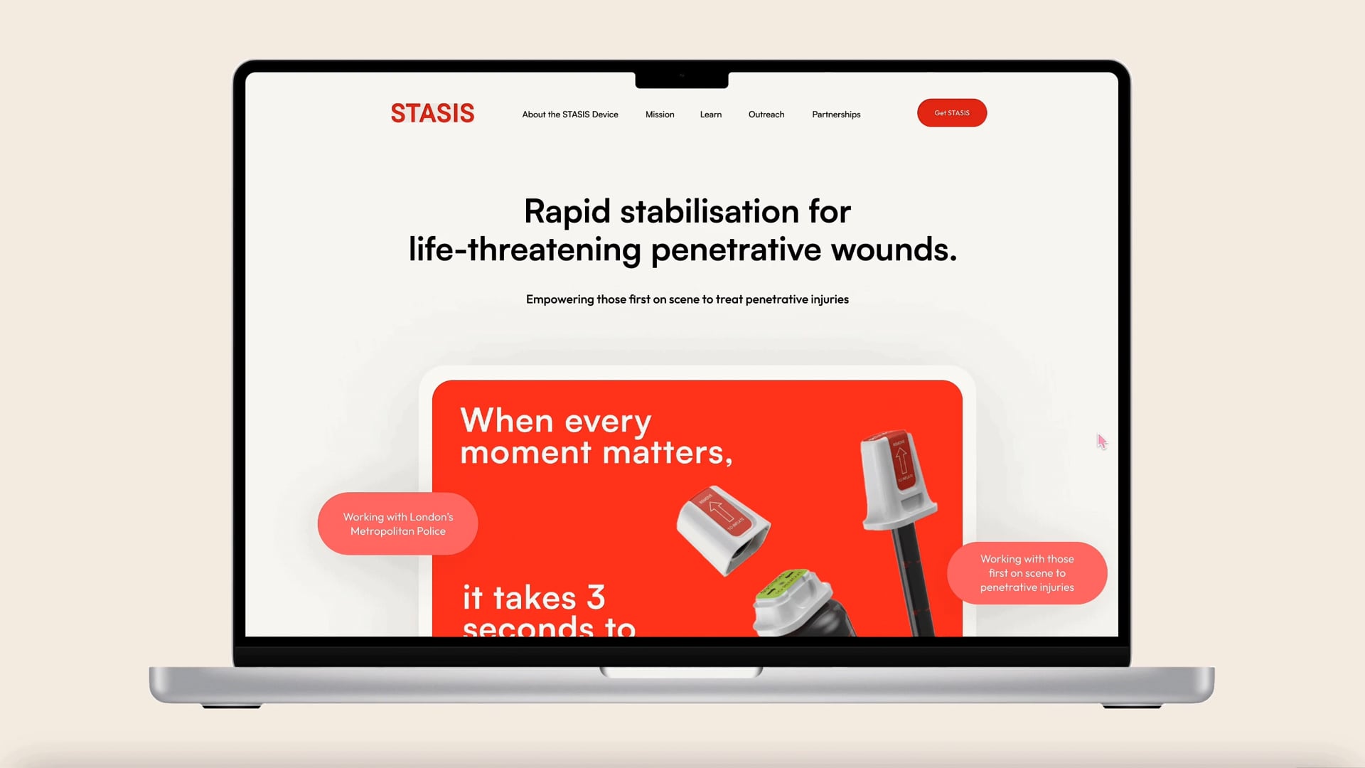
For my first route, I chose a theme of community, emphasising how the device (called REACT at the time) could help combat the devastating effects of knife crime on communities in the UK. The second route was focused on first responders and had a more traditional medical feel to it with a palette of blue and green to evoke feelings of trust and safety. My third route was centred around time and criticality, with the slogan of ‘3 Seconds to Save a Life’, which included shades of red to communicate emergency and urgency. Route three was selected for development, and I entered the second and final week of the challenge with lots of development to do. I love creating brands from scratch, so I really enjoyed that part of this project.
Now that I had a clear visual style, I could translate this into my various touchpoints. I renamed the devic STASIS, meaning the stopping of a flow of something, to reflect what the device itself aims to do. I then took to Illustrator to iron out any brand identity development, then moved to Figma to prototype a website, as well as some LinkedIn social media graphics. I am so glad I learned some Figma at the beginning of Level 6; I’ve managed to include some prototyping in most of my projects since, which really helps to bring brands to life.


One of the most important parts of the design challenge was crafting a copy matrix/naming hierarchy. Dyson uses a specific naming system to refer to and describe its products according to where they’re presented, so the same needed to be done for this project. At the end of the challenge, I received feedback that my copy matrix was one of the strongest elements of my concept.
At the end of the project, all the teams pitched their concepts to Dyson. I love presenting my work – despite any nerves, I love being able to talk about the thoughts and strategies behind what I decide to create and hearing feedback on how I can improve my work and approach. Following the pitches, I was named the winner of the Dyson Creative Challenge, a very proud moment for me, as it was the first design award I had ever been given.
I learned so much over the course of this project, like how to prioritise my time when juggling multiple projects, how to approach crafting a brand for a completely new product and how to trust yourself to create something really cool with the skills that you have (even if you don’t even know how to make a square in Blender).


