- Home
- MA Journal

But this year, I was unable to find any inspiration in the planners that seem to be everywhere. I was full of ideas and eager to play with my newfound talent after taking a letterpress introductory course. Then it occurred to them to create a handmade letterpress calendar!
Unquestionably, it was an ambitious project. However, the idea of giving loved ones something genuinely one-of-a-kind and infused with the joy of creating excited me no end. But ambition and difficulties frequently go hand in hand. Unlike pre-printed calendars, this one would require careful hand-setting of each letter, including the grid, the numbers, and even the month names. An additional level of intricacy was introduced to the formula by the different counts of days in every month. But rather than acting as obstacles, these were calls to action to push the envelope and fully utilise the letterpress medium.
I was lucky not to be the only one with this newfound passion. I started this creative journey with a classmate after discussing what I wanted to do. We imagined the dates to be delicately printed on clear tracing paper, with the months (printed on separate sheets) peeking through in bright bursts of colour. The tracing paper's soft, almost ethereal feel would contrast well with the heavier paper used for the month names, resulting in an intriguing interplay of textures created by this layering.
The tracing paper's fragile nature created a special challenge. We had to meticulously calibrate the pressure on the letterpress to ensure clear, crisp impressions without damaging the paper. Every page turned into a nuanced performance requiring all our concentration as we made sure the tiny grid and numbers lined up precisely. Witnessing the painstaking care required for each page truly instilled an appreciation for the meticulous craftsmanship involved in traditional printing techniques.
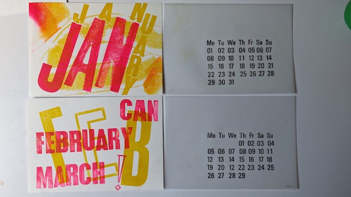
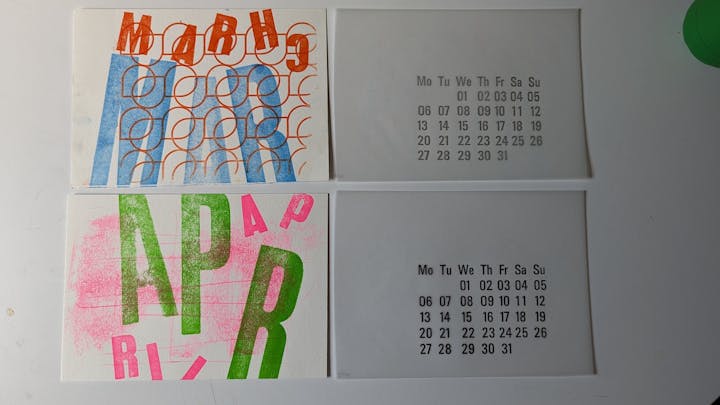
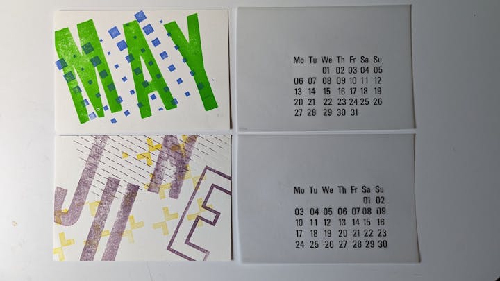
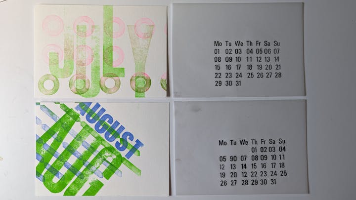
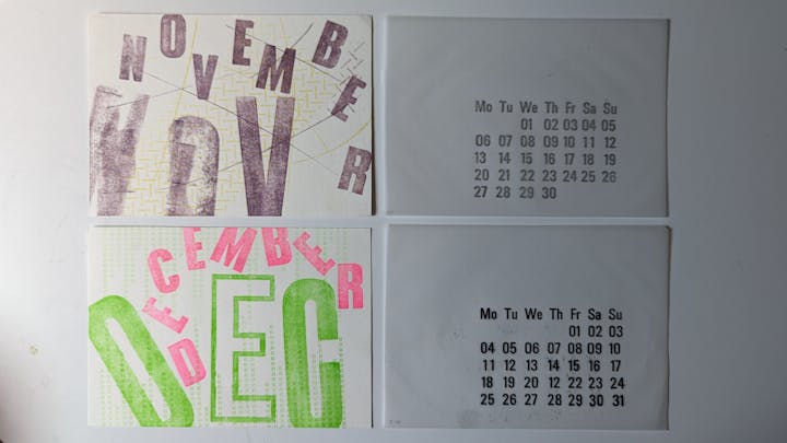
Once the dates were meticulously printed, we turned our attention to the month names. We abandoned the strict, grid-like design in favour of a silly, creative approach. A different colour gradient was brought to life for the background of each month, offering some visual intrigue and playfulness. The arrangement of the month names became an exercise in artistic freedom, abandoning the confines of a grid for a more intuitive and visually pleasing layout. This approach allowed us to experiment and embrace spontaneous design choices, even if the result wasn't picture-perfect. In fact, the slight imperfections became part of the charm, reflecting the handcrafted nature of the calendar and adding a touch of personality. We used textured sheets to add visual interest and tactile pleasure. These were carefully pressed onto the backdrop papers before printing the month names, creating a lovely textured aspect that enhanced the contrast between the translucent tracing paper and the coloured paper. The finished product was a sensory feast, with a visually appealing experience and a distinct texture quality that enticed viewers to run their fingertips across its surface.
This labour of love went beyond the mere purpose of documenting the passage of time. It became a tribute to the ongoing beauty and artistry of classic printing techniques, a celebration of the creative process, and a reminder of the magic that occurs when we step outside of the ordinary and embrace the thrill of making something with our own hands. Every time we flip the page, we are brought back to the ink workshop, with the pleasant press of the wooden blocks against the paper and the delightful whirling of the ink roller. The whole experience serves as a gentle reminder that the most satisfying experiences are often those, we build ourselves, and the thrill of sharing these handcrafted masterpieces with loved ones adds an extra layer of meaning and connection.